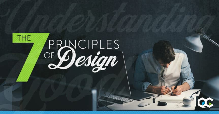
While the term “design” certainly encompasses art, it’s distinctly separate from what is considered traditional or fine art. It is said that good design must serve a purpose and/or speak to an audience. It sounds simple enough, but there are many elements that play a part in “good design”. Many would argue that art and design are separated by some invisible line where function and audience lose subjectivity. As the debate goes on regarding “Art vs. Design”, some believe “artists primarily work off of instinct, whereas designers employ a methodical, data-driven process.” My personal belief is that design encompasses the utilization of many disciplines and principles to solve a problem – visually. When done properly, good design will evoke emotion, induce memory (brand recognition) and build loyalty. When done poorly, well… you’ve just wasted a lot of time (and money). To me, a passionate designer, good design and effective branding is an artform in and of itself. In order to give you a strong foundation, we’re going to start with the 7 principles of design.
1. Emphasis – this one is easy, simply ask yourself, who is the audience and what do they need to know? Let’s say you’re designing a poster for a new band in town. What’s the main intent of the poster? Do we want to know who this band is or do we want to know when and where they are going to be performing? Once you’ve outlined the hierarchy of information, you’ll know where to add the emphasis.

Now, hopefully… there’s no missing the show!
2. Balance & Alignment – Ok, now this can be a tough one and at the same time equally critical to good design. Every element you place on a page or artboard has a weight and subsequently needs to be in balance. If your design is off balance it will instantly detract from your design. The viewer or audience may not even know why something seems off, but it doesn’t matter… you’ve lost ‘em.
A good way to achieve balance and alignment is through the use of symmetry, or even asymmetry. A good example of an asymmetrical design can be achieved through the use of juxtaposition. Utilizing one large element in conjunction with several smaller elements to create an uneven, yet well balanced design.

3. Contrast – Oh, how I love me some contrast. When clients ask for the design to “pop”, contrast is really what they’re asking for. Contrast can be achieved in a variety of different ways. Each of which takes trial and error, but the process of finding that perfect contrast is fun (and sometimes challenging)
- Color (or lack-thereof) can be used to show contrast. Whether it through hue, tint or value (black and white having the highest value of contrast) it is an effective means of using contrast within a design.
- Size – by juxtapositioning different elements in a design based on size and weight you can effectively achieve contrast and focus attention.
- Shape – this is the same as above but using shapes instead of weight. Using a sharp angle against softer elements can be a great way to add contrast and focus in your design.
- Typography – this one is possibly my favorite (and IMHO) one of the most eloquent ways to utilize contrast in design. By finding that perfect font pairing you can achieve that subtle (or sometimes not-so-subtle) contrast to round-out your composition. (Here’s a nice, free resource to help you find that perfect font pairing).
- Texture – Using texture in design is always fun, but can very easily be overdone. When using texture in your design be careful not to over do it. A subtle texture here or there can add that perfect touch to a design, but on the other side of the coin, using too many textures can severely degrade your work.
- Surprise – Use the unexpected to draw attention and create contrast. This can be tricky and fun, but also be weary – it’s not an easy feat to pull off.
4. Repetition (or Pattern) – Repetition is said to unify and strengthen a design. A good use-case for repetition is seen throughout large and small, well-thought out brands in their typography. Typically a brand will adopt or utilize 2 to 3 typefaces within its core branding, and on a micro-level, typically the same rings true for individual ad campaigns. One can also utilize more traditional, graphic patterns or repetition of graphic elements within a design or branding to create an imprint in their audiences’ mind. Repetition can be imperative in creating brand unity across all media (i.e. product packaging, web presence, online and print ads, marketing collateral, social media presence, etc.).

5. Proportion – This one seems to get lost in the mix sometimes, but if you’ve mastered balance and contrast, proportion just kinda fits in naturally. You can use varying sizes to add contrast to your design and just as easily achieve balance by juxtaposing large areas of white space with small areas of elemental focus.

6. Rhythm & Movement – Ok, about the only time I have rhythm is when I’m creating. That’s cool with me though, I hate to dance. So what does it even mean to create movement or rhythm (or better yet, why is that word so hard to spell)? Anyways… consider again that the main purpose of any design is to solve a problem by providing a solution. Go back to the hierarchy of information you outlined when you started the design process. Giving movement to your design would be to control the audiences’ eye throughout the flow of that information. If this flow isn’t properly executed within your design, you’ve not done your job.

7. White space – Ahhh…yes, white space. White space is the dark matter of design. While all designers can agree it’s there, many still struggle to recognize or properly utilize its beauty. Yes, it’s true, sometimes less really is more. Whether you’re using white space to balance areas of focus or to create negative space within a logo, it’s impact can be powerful. It doesn’t really sound all too complicated, but I assure you, it can be one of the harder principles of design to perfect.

Now that we’ve briefly covered the 7 principles of design, it’s time to put them to work. Don’t worry about hitting all of them in every design, but rather practice one at a time and then allow yourself to bring in more over time. Soon enough, you’ll find yourself doing these things naturally. You’ll also start looking at advertisements and marketing campaigns from a whole new perspective.
Comments 1
kJjsTVdepLv